About
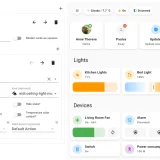
Slider Button Card is a dashboard card that combines a button with an integrated slider. It works with automation, light, switch, fan, cover, input boolean, input number, media player, number, climate and lock entities. The slider controls brightness on lights by default, position on covers, volume on media players and target temperature on climate entities. For fans the icon rotates with the fan speed, and for switches and locks the slider can act as a toggle instead of a slider. The card has a visual editor, supports custom styling through Card mod, and ships with translations in about ten languages. It can be installed through the Marketplace or by adding the file manually as a dashboard resource.
Automatic summary of the README of custom-cards/slider-button-card. Something wrong, or are you the maintainer and want your own text here? Get in touch
Supports
From the Marketplace Installed through the Marketplace, formerly HACS.
Setting it up
Install it from the Marketplace, then add a card of this type to a dashboard.
From the README
A button card with integrated slider for automation, light, switch, fan, cover, input_boolean, input_number, media_player, number, climate, lock entities.
Information
- GitHub stars
- 142
- Upkeep
- No update in over 18 months
- Version
- v1.13.0,
- Kind
- Dashboard card
- Needs
- Needs the Marketplace (HACS on 2026.10 and older)
- Issues
- Report an issue