About
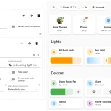
button-card is a dashboard card that shows entities as configurable buttons. It works with any entity and supports tap, hold and double tap actions, including toggle, more-info, navigate, URL, assist and service calls. The icon can have its own action that takes precedence over the card action, and momentary press and release actions are available. Appearance can be changed through custom colors, state definitions with their own icon and style, sizes, aspect ratio, layouts and CSS, with JavaScript templates supported. Further options include blink and rotation animations, confirmation popups, password or PIN protection for actions, and haptic feedback in the iOS companion app.
Automatic summary of the README of custom-cards/button-card. Something wrong, or are you the maintainer and want your own text here? Get in touch
Supports
From the Marketplace Installed through the Marketplace, formerly HACS.
Actively maintained Its author released or pushed a change in the last six months.
Setting it up
Install it from the Marketplace, then add a card of this type to a dashboard.
Information
- GitHub stars
- 2.5k
- Upkeep
- Updated in the last 6 months
- Version
- v7.0.1,
- Kind
- Dashboard card
- Needs
- Needs the Marketplace (HACS on 2026.10 and older)
- Issues
- Report an issue